Best Free Online Data Visualization Tools
Data Visualization is a widely used technique to visualize, analyze, and present datasets with the help of different types of graphs. It is an effective way to evaluate a large set of data using pictorial representations. You can visualize data using a dedicated tool.
In this article, I am going to mention the best free online data visualization tools using which you can generate graphs and charts for your datasets. These online services let you generate bar, line, scatter, area, pie, doughnut, radar, box plot, column, and many more types of graphs. You can customize graph styling, set up data range and series, and then download your graph. Let’s have a look at these web services below.
Best Free Online Data Visualization Tools
Here are the free online data visualizer websites to create different types of graphs:
- LiveGap
- RAWGraphs
- Datawrapper
- Statpedia
- Google Sheets
Check out these tools in detail!
1] LiveGap
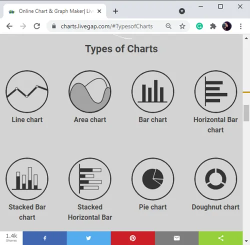
LiveGap is a free online data visualization tool to make a variety of charts. Using it, you can create line, area, bar, pie, doughnut, radar, polar area, step, and a lot more charts. You can explore its gallery and choose a chart template to visualize datasets. The good thing about this tool is that it lets you animate your charts. You can set up an animation effect and enter the number of steps to customize your animated graph.
To use this web service, click on the Make Your Chart option and then select a chart template or type. It will open a chart editor window where you can enter your data and visualize it on the graph. You can customize various chart properties including layout, size, legends, colors, add annotations, animate chart, grid, and more. After customizing your graph, you can save it in HTML (use for animated chart) and PNG formats.
If you want to save your charts on the cloud, sign-up for this free service and store all your graphs on your account.
2] RAWGraphs

RAWGraphs is a free web service to create various charts and visualize data. It lets you import datasets from spreadsheet files (CSV, XLS, XLSX, JSON, etc.) and URL, or you can manually enter your data into it. After adding a dataset, you can select a chart to draw. It offers some standard and multiple advanced types of charts to visualize data. Choose the one you want to create and then map your dimensions to define X-axis, Y-axis, label, size, and color. You will be able to visualize the graph that you can customize. Plus, it lets you export a chart in SVG, PNG, and JSON formats.
The charts it lets you generate are Voronoi Tessellation, Treemap, Beeswarm Plot, Box Plot, Contour Plot, Convex Hull, Hexagonal Binning, Scatter Plot, Circle Packing, Sunburst, Alluvial diagram, Parallel coordinate, Bar Chart, Pie Chart, StreamGraph, Area Graph, Circular Dendrogram, Cluster Dendrogram, Bump Chart, Horizon Graph, and Gantt Chart.
3] Datawrapper

Datawrapper is another free online data visualization tool. It lets you generate various graphs for datasets including bar, line, area, column, doughnut, pie, table, etc. You can upload data from CSV, XLS, Google Sheet, and URL to create graphs. Additionally, it lets you customize axis, labels, title, description, size, and layout to customize your graphs. You can download a chart in a PNG image or generate its embed link.
4] Statpedia

Statpedia is a free online data visualization chart maker to create graphs from manually entered data. To use it, go to its website and click on Create Stat option. After that, enter or copy and paste your data in the Data tab. You can then select a type of chart, customize styling, enter chart title, data labels, tags, etc., and visualize the respective chart. It lets you create bar, line, scatter, pie, column, and a few other charts.
It lets you share generated graph via URL link and you can also get an embed code of your graph.
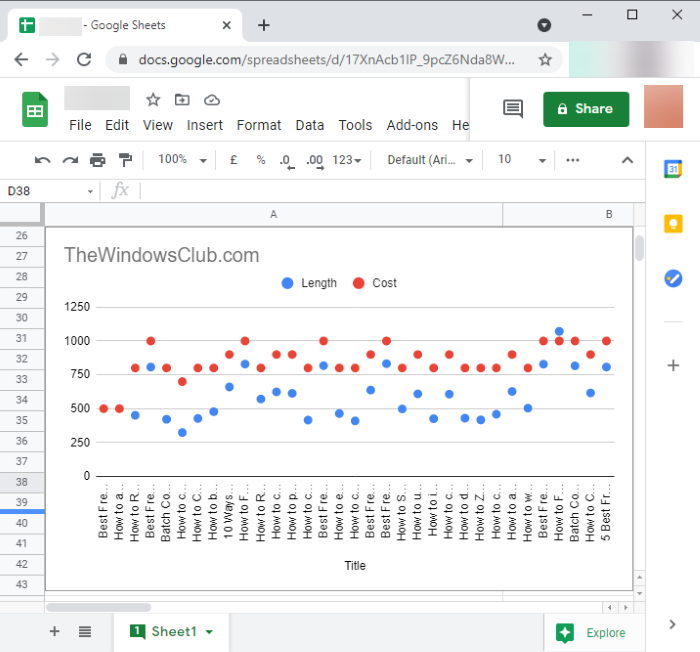
5] Google Sheets

Google Sheets is a free alternative to an online data visualization tool. It is a widely used cloud-based spreadsheet processor using which you can create different types of charts. Some of the graphs that it lets you draw include line, area, scatter, geo chart, histogram, pie, gauge, candlestick, scorecard, timeline chart, and some more. You can generate graphs by creating a dataset from scratch or uploading one from Excel and other supported files.
To visualize graphs in Google Sheet, add a dataset and then go to the Insert menu. From here, click on the Chart option which will open a Chart Editor. You can then select a chart type from available ones, specify data range to represent on the graph, and add data series. Furthermore, you can customize chart style, title, legends, gridlines, and other parameters. You can later download the chart as a PNG image, PDF, SVG vector image, or publish it to the web.
Try any of these free online data visualization tools and create a variety of graphs to analyze your datasets.